Infographics Part 2: Using infogr.am

A couple of months a go, I wrote a post about creating infographics – I am seeing an increasing number of infographics shared on my timeline these days and many of them seem to be created by teachers.  Since writing my post, I have discovered a new tool that I think is so good, it warrants a follow up post.

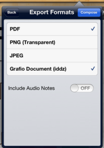
Infogr.am is a (currently) free web app – currently in beta –  for creating charts and infographics.  The main difference between Infogr.am and the tools that I posted about before (easel.ly and Grafio for iPad) is that it is focussed more on the DATA side of infographics, than the use of images and graphics. I know that all infographics feature data in some way, but a lot of the tools I have used have been focused on the use of images rather than handling numeric data.

Infogr.am doesn’t really have drawing tools – it does however, have a wide set of options for building charts and visual data representations of various types.

Infogr.am

Infogr.am will allow you to import data straight from an excel spreadsheet, or you can paste/type data directly into their own, easy to use spreadsheet interface.  Video, image and map imports are also supported so there is certainly lots of potential for building something that looks really good. Customisation is limited to the themes on offer, but they look good and it is easy to adapt them for your needs.  I assume that more themes will be supported when Infogr.am leaves beta and the “Pro” version comes online.

There currently six themes to choose from

There currently six themes to choose from

I have not used Inforgr.am with students, though I believe that they would be able to use it with few problems.  It does require an account (the app is currently free) so if you aren’t comfortable with the students doing it, you might want to try something else.

I actually think that Infogr.am has great potential as a teacher tool – for example it would be a great way of producing really attractive visualisations of school/department data.  I am currently in the process of using it to generate visualisations of the  pupil voice data that I recently gathered using Google Forms.

You can see my (first) attempt here, with the caveat that it is very much a work in progress

http://infogr.am/ICT-Department-Pupil-Voice-2013/

It would make a great tool for representing exam results, or indeed any data sets that would warrant a more visual or interactive way of engaging the audience.

Pros:

  • Free (at the moment)
  • Excel import (or use their inbuilt spreadsheet tool)
  • Easy to use interface
  • Wide range of options for displaying data
  • Brilliant for infographics driven by numeric data
  • Sharing via Twitter, Facebook, Pinterest or – via embedding – Blog.
  • Choice of themes
  • Option to add other media (such as maps, videos, images)

Cons:

  • No download – infographics can be only be published to the Infogr.am site
  • No graphics tools
  • Doesn’t seem to work on a tablet
  • Account needed (maybe an issue for students)

If you are at all interested in creating infographics, I really recommend giving Infogr.am a go.

Creating Infographics (using Grafio, easel.ly and more)

Title Image

I love infographics and have been experimenting with creating my own for a while.  I have also written an infographics project for Year 7 as part of our KS3 ICT programme, so  I thought I would share a couple of the best ways I have found for making infographics either for yourself or with students.

Most of the design blogs I read in the subject seemed to require significant knowledge of Adobe Illustrator (which I haven’t got) or significant design skills (which I also don’t have!) It also seemed to be difficult to get the feel and authentic look of an infographic in most of the DTP or graphics programs I have used (though this may well be just me) so here are a couple of suggestions..

 Grafio

Grafio (available or iPad and iPhone) is a hugely impressive app that allows you to create infographics (or indeed pretty much any chart or diagram) with a minimum of fuss.  The app would be equally useful for creating system flowcharts or venn diagrams and there are  a number of ways in which it could be used in different subject areas.

The superb design of the app means the user is given a wide set of tools, accessed through clear, simple and uncluttered interface and enhanced by clever use of gestures.

The basic Grafio tools - the Properties section changes according to context (like Adobe Flash, Fireworks et al)

The basic Grafio tools – the “Object Properties” section changes according to context (like Adobe Flash, Fireworks et al)

It contains a decent library of built-in vector objects and is easy to create your own shapes (which can be added to the library) or import others from the your iPad’s camera roll.

The shape recognition tool is particularly clever and the app does an excellent job of working out what you have tried to draw and then improving it!

There is also a neat Tips & Tricks feature built into the app

There is also a neat Tips & Tricks feature built into the app

The app provides some beautifully presented how-to-guides (created with the app itself) and includes some sample documents which you can fiddle about with to see how they were made.  In truth, the app is very easy to learn and most features are easily accessible.

Share Editable

There are a wide range of sharing options (via mail, Dropbox, iTunes etc) and the ability to share an editable Grafio document is particularly useful – it would be straightforward to create a template or outline of a document and share it with students.

Grafio isn’t the cheapest app out there – £5.99 – but  you get what you pay for, which in this  case is a phone/tablet app with the featureset of a proper graphics package.   I would urge you to try the free version first.  It shouldn’t take more than a few minutes playing with it to convince you that it is worth paying for the full version.

If you would like to see the app in action, the publishers have helpfully provided some video tutorials on their YouTube channel and you can check them out here.  Below is an example of my first attempt at an infographic in Grafio – please don’t judge the quality of the app based on my limitations as a designer!  For me, Grafio ranks alongside Phoster as my favourite for creating classroom displays or posters and would also be perfect for student use.

My first attempt

My first attempt

Easel.ly

Easel.ly is a web app, currently in beta, that also does a great job of simplifying the process of creating infographics.  I used this successfully with Year 7 as a part of a  scheme of work and was very pleased with the results.  (I actually think infographics make a great KS3 ICT project – there are all sorts of elements in there, such as the use of data, the importance of good research, graphics design…)

[Disclaimer: At the time of writing easel.ly is FREE but it IS in beta.. so it could easily become a paid service or disappear altogether.  Do bear this in mind when deciding whether you would want to use it in the classroom]

You do need to sign up to (either with Facebook or via an email address) to use easel.ly – our school has full Google Apps for Education integration so we had a secure managed email address for each student to use.

As a web app, easel.ly does not boast the full range of features that Grafio can offer – but it is certainly good enough to produce an effective infographic.  If you’d like to see an example, you can download an easel.ly infographic I created to show the 4B’s (again applying my disclaimer regarding my own skills!)The 4B's infographic

Below is a screencast I created showing how to use easel.ly which gives a pretty good idea of the features it has.

Some of the nice features of this app include..

  • You can upload your own images – this is a nice touch, though the feature  occassionally didn’t work when my students tried it
  • There are a nice range of custom templates provided or there is the choice to use a blank canvas
  • There is a surprisingly good range of vector images included in the image library
  • At the current time there seem to be no limiations on use, other than the fact that only one infographic can be saved/edited at one time
  • It is very easy to use

Alternatives

I am very happy with both these tools at present but am looking to see if there better ones available.

  • Piktochart is a nice alternative to easel.ly (though the free version does seem to have a few limitations) A new version has just been released so I am going to revisit Piktochart.
  • Lucidchart (another web tool) can be used for infographics.  I’m looking very closely at this for next year since it has Google Drive integration baked in – which takes it to another level as far as I’m concerned.
  • Inkscape is an open source vector graphics package which looks to have potential as an infographics tool – and has the obvious bonus of being totally free.  T

I would be interested to know what you think of these applications – and indeed, which other mobile apps, web apps or programs you are using to create infographics yourself, or with your students.